We've all done them at least once when decorating our home. Here are the most common mistakes that are easy to fall into when you are struggling with the preparation of the entrance.
1. Exaggerate with furniture and accessories
Often, for fear of disorder, we tend to fill all the available space with lots of storage furniture, without considering the balance between full and empty spaces.
This balance, at the entrance, is even more important than in the other rooms.
The entrance, in fact, should have an airy and light appearance . It's the first place you set foot in the house and, when it's too cluttered with furniture, it tends to be a little scary.
The same goes for decorations and furnishing accessories .
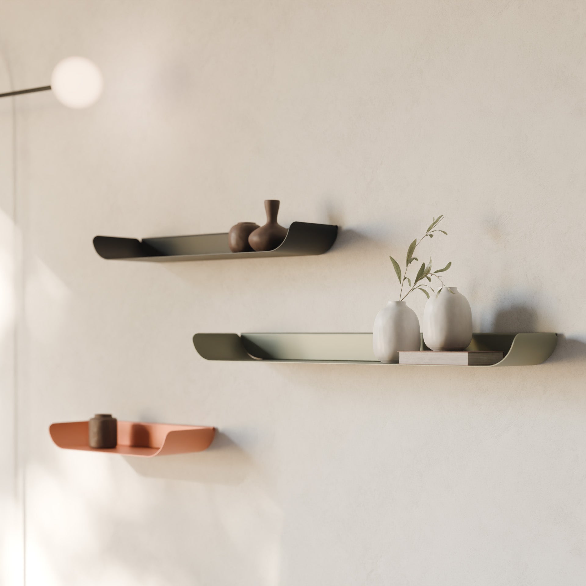
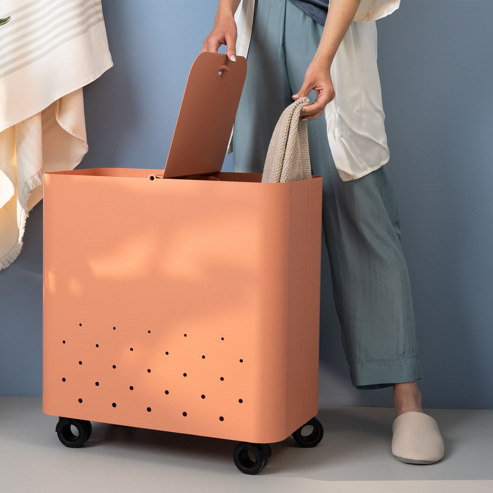
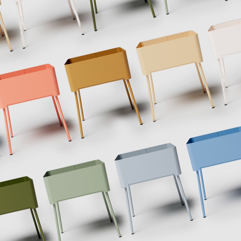
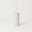
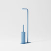
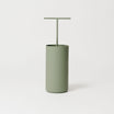
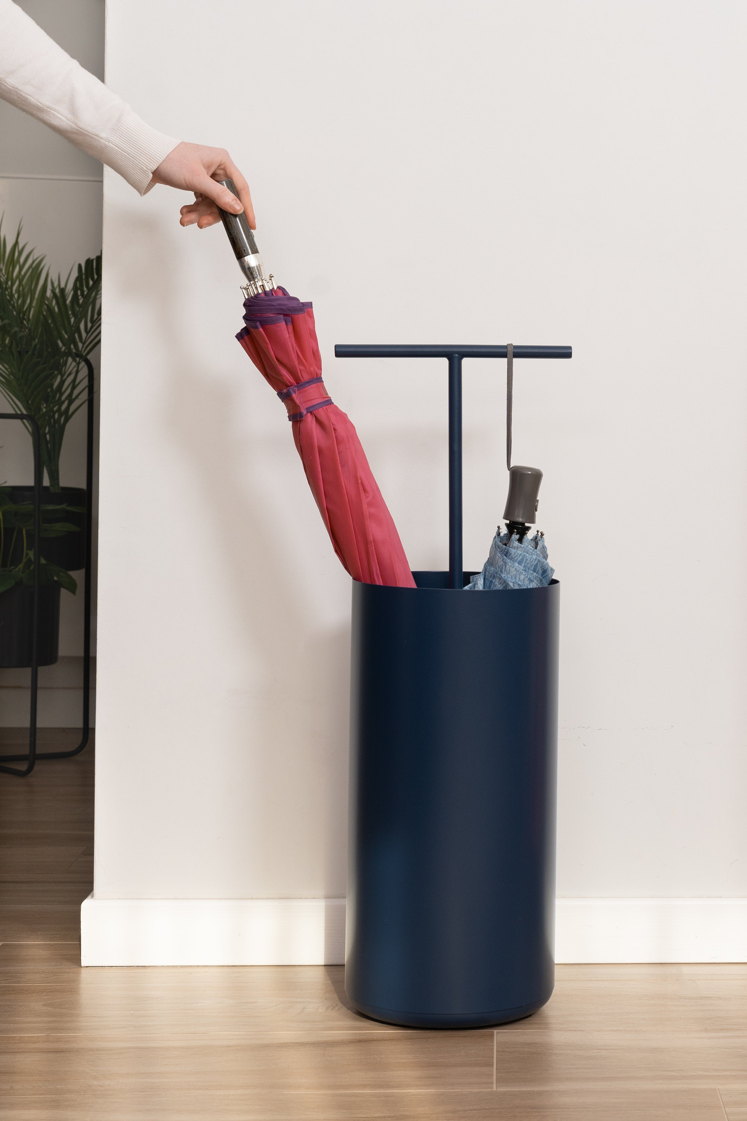
Better to avoid excesses of decorative objects. It makes much more sense to focus on accessories that are beautiful to look at, but also functional (for example colored pocket trays , designer umbrella stands or small, particular and capacious containers ).
It is not the quantity of objects that makes an entrance beautiful, but the balance of volumes, colors and stylistic combinations.
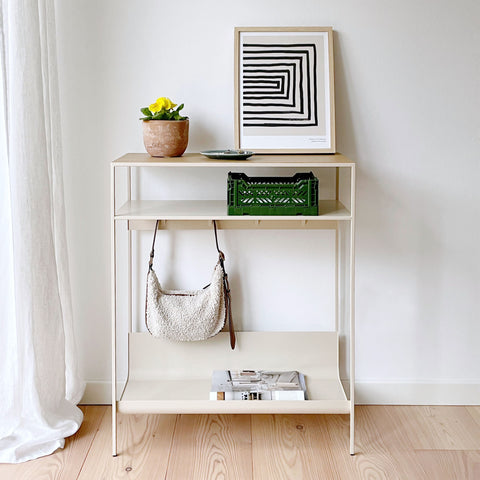
2. Create an anonymous environment, without magic
On the other hand, even overdoing it by default can penalize the environment.
Even in the most minimal entrances, the element of amazement should never be missing.
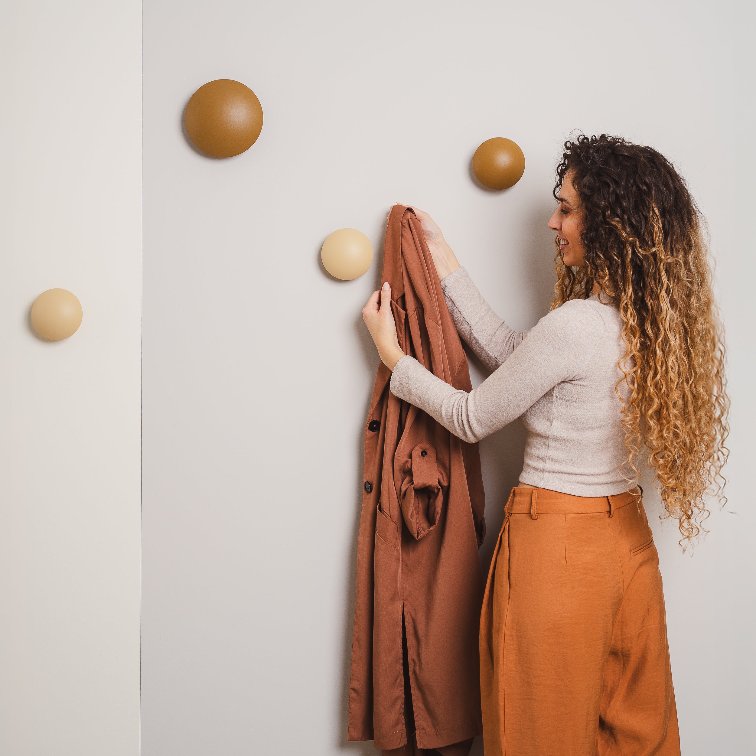
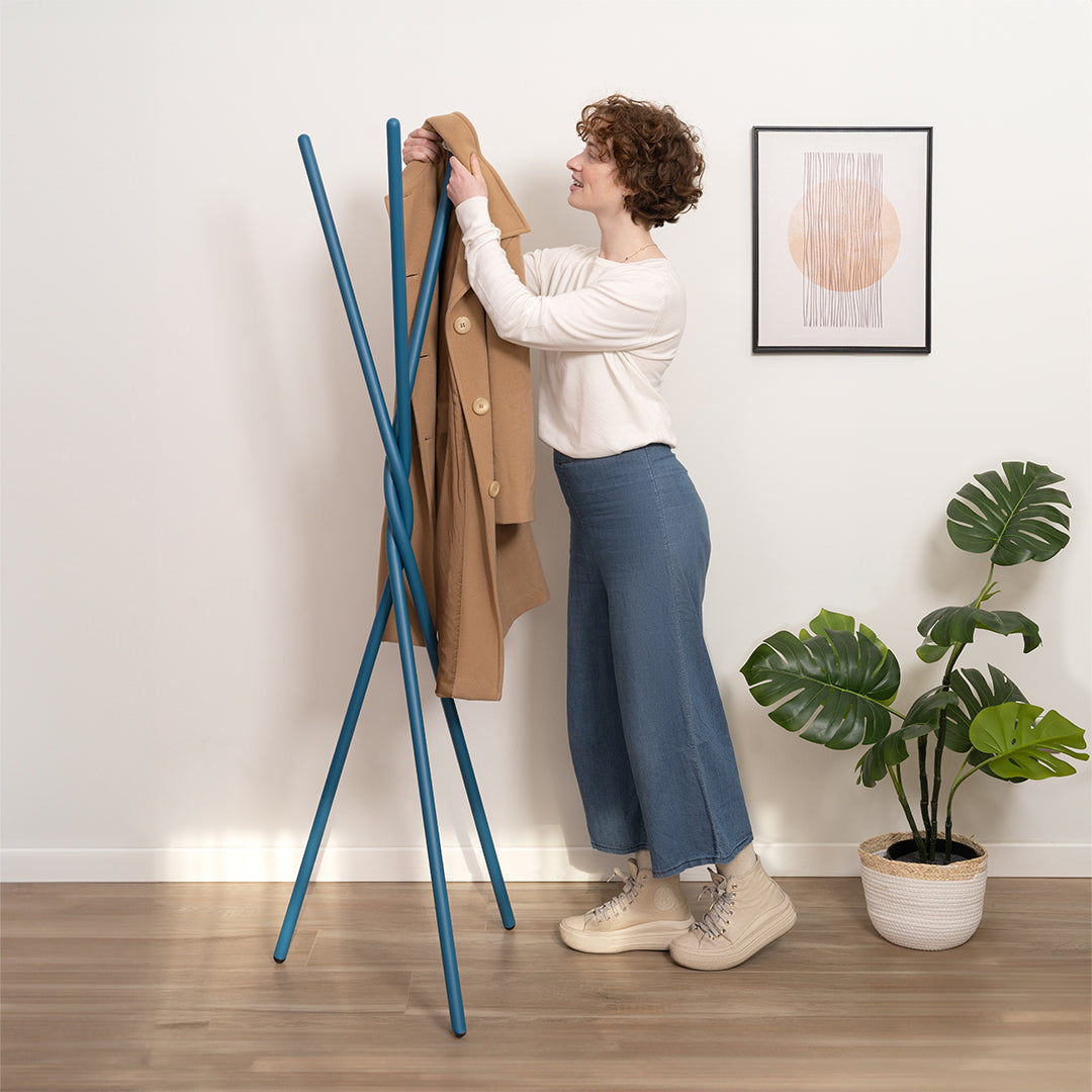
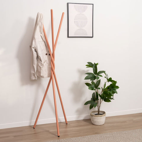
An unexpected touch of colour, a painting, an interesting wallpaper or a sculptural and functional design object (for example our Milo coat hanger , with sinuous and intertwined shapes): all these elements can become the focal point of the environment, the which attracts attention and leaves those who enter speechless.
3. Furnish the entrance as if it were that of another house
The problem occurs when , in the rush to finish, you make impulsive purchases that do not take into account the style of the rest of the house.
Other times months or years pass before its setup is taken into consideration (it's normal, it happens in many homes) and in the meantime we've changed our tastes a bit.
In both cases the result is an entrance furnished as if it were that of another house.
However, it is important to keep a common thread in all the rooms of the house to create a sense of continuity between one area and another. Same style or same mix of styles, same color palette (you can play with the doses by changing them from one room to another), same mix of materials.
Are you looking for some good ideas to take advantage of to furnish the entrance of your modern home? Read our 4 proposals .
