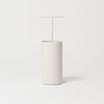
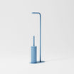

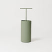
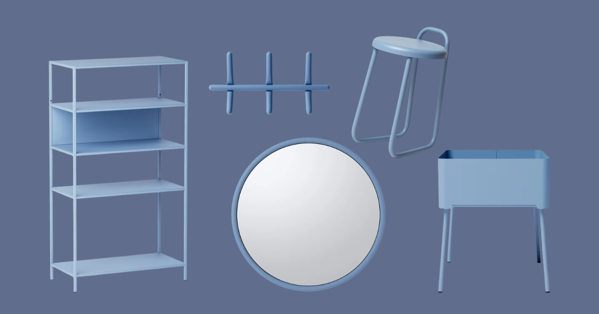
Bright, deep, never ordinary.
It is not powder blue, whale blue, or even sugar paper blue. It is not a dark, serious blue, nor is it a light, ethereal sky blue: it sits exactly in between.
Cornflower Blue is one of those colors that, in interior design, is perfect both for revitalizing a rather neutral palette and for structured palettes (below, you will find seven featuring unexpected combinations).
In this article, we explain where this color comes from, what it means, how it is created, and above all, we show you 7 Hiro mood boards to inspire you to bring it into your home.
What color is Cornflower Blue?
Cornflower Blue is a medium-intense shade of blue with a slight violet component. It takes its name from the flower of the same name (Centaurea cyanus), which displays one of the purest and most vivid blues found in nature. It is a saturated but not overpowering color: it conveys energy and confidence.
It is unequivocally classified as a cool color, but we can tell you in advance that the presence of red in it makes pairing this color with warm shades both possible and interesting (for example, reds, browns, and pinks).
What is the RAL code for Cornflower Blue?
In the RAL scale, which assigns each color a precise code to avoid subjective interpretations, the Cornflower Blue from the Hiro collection corresponds to RAL 5014.
This means that, if you want to have a surface painted in exactly this color, you can give your trusted paint supplier the RAL 5014 code and achieve the same shade.
Has it already stolen your heart? Discover the furniture and accessories in Cornflower Blue from the Hiro collection.
Cornflower Blue: these characteristics reveal what it pairs well with
Let's analyze the color together: let's break it down to fully understand its characteristics and identify winning combinations in advance.
- Its saturation is medium-high, meaning it is a fairly vibrant and visually prominent color. If you have a Cornflower Blue shelf at home, it does not go unnoticed—you fall in love with it and choose it for precisely this reason: it stands out!
-
It leans slightly toward violet because it contains red. This component makes it perfect for pairing with red-based colors and materials.
When we talk about colors, we mean reds (both warm and cool), reddish browns, and pinks (from antique pink to terracotta).
When it comes to materials, this means reddish wood (cherry furniture, doussie parquet, mahogany furnishings), terracotta floors, and red brick walls. If you have these elements at home, Cornflower Blue is an excellent match. - Good luminosity: cornflower blue is a medium-dark color, which allows it to work beautifully with both light and dark tones. Although it isn’t especially bright, its vibrancy also makes it suitable for rooms that aren’t particularly bright.
See the power of Cornflower Blue for yourself: order the Hiro color swatch set and have fun experimenting with combinations.
How is cornflower blue made?
Starting with a pure blue base, cornflower blue is created by:
- adding a small amount of red, which gives it the slightly violet undertone typical of the flower;
- lightening it slightly with white to increase its brightness without dulling its intensity;
- avoiding excess black, which would turn it into a darker, more “nighttime” blue and make it lose its natural vibrancy.
The result is a fairly saturated color, but never a heavy one—one reason it works well with countless interior styles, from contemporary looks to those with vintage influences.
Giving something Cornflower Blue: what does it mean?
The cornflower (Centaurea cyanus) has been one of the most meaningful flowers in European tradition for centuries. In the Victorian language of flowers and Central European folklore, it was associated above all with fidelity, constancy, sincerity, and gentle love, appearing in love letters and popular customs as a symbol of an authentic, lasting bond.
Giving a Cornflower Blue object can therefore be seen as a gesture that communicates trust, sincere affection, loyalty, and closeness: a gift that speaks of deep relationships—not necessarily romantic ones, but also strong friendships and genuine affection.
Gift ideas for the home in Cornflower Blue
Looking for a gift idea that won’t go unnoticed? Here are four Italian-made design objects that are highly functional and aesthetically impeccable.
- Lora Clock: for those who experience time with style rather than simply watching it.
- Everyday Box Organizer: everyday clutter doesn’t stand a chance with a practical, easy-to-move multi-compartment container that’s suitable for literally every room.
- Demetra fruit bowl set: even a simple apple becomes a design element when displayed with care.
- Marea, shower robe holder: available as a wall-mounted version or with hooks, which can be hung directly on the shower without drilling. Its wave pattern gives it a playful touch: a practical yet eye-catching accessory.
Below, you’ll find seven Hiro palettes to inspire you.
How to pair Cornflower Blue: 7 moodboards for inspiration
Cornflower Blue is a versatile color: you can build the entire palette around cool tones or surprise with combinations of warm, robust shades. Here are 7 palettes, each with its own personality.

1. Cornflower Blue, Sugar Paper Gray and Frida Red
A palette with a powerful visual impact. Light, powdery Sugar Paper Gray softens Cornflower Blue, while Frida Red adds a bold note and intentionally disrupts the balance.

2. Cornflower Blue, Shell White and Antique Pink
A delicate and romantic combination, perfect for anyone looking for a bright space that never feels flat. Shell White provides a neutral, airy base, while Antique Pink introduces a warm, delicate note that softens the blue’s saturation.

3. Cornflower Blue, Midnight Blue and Sugar Paper Gray
A monochromatic palette built entirely around shades of blue, with varying levels of intensity: from the light, powdery shade of Sugar Paper Gray, through medium Cornflower Blue, to the deep Midnight Blue. The result is an enveloping, almost cinematic space.
This combination also works particularly well in the bedroom: if you’re looking for more ideas on the subject, you’ll find an in-depth guide dedicated to it here: Which colors should you use in the bedroom? RAL colors and ideas for a top-quality rest.

4. Cornflower Blue, Corten effect and Shell White
Here, contrast is the real star. Cornflower Blue and Corten are, in a sense, polar opposites: one cool and vivid, the other warm and tactile, with a surface that recalls industrial architecture. Precisely for this reason, they balance each other perfectly when combined. Shell White gives the combination room to breathe.

5. Cornflower Blue, Fossil Green, and Shell White
A balanced palette in which Cornflower Blue and Fossil Green share a very similar level of brightness: neither color dominates the other, and the dialogue between the two shades feels natural and relaxing. Shell White is the perfect base for this pairing because it harmonizes the composition while making both colors stand out.

6. Cornflower Blue, Midnight Blue, and Clay
A deep and enveloping mix. The two blues create a solid, intense foundation, while Clay, with its orange undertone, introduces warmth and a direct connection to the earth, balancing the cooler component of the palette.

7. Cornflower Blue, Shell White, and Terracotta
The most colorful and playful palette of the seven. Shell White serves as a neutral canvas, Terracotta brings energy and warmth, and Cornflower Blue comes in as a vibrant accent that breaks up the composition with an unexpected twist.
Has a palette stolen your heart? Put it into practice right away by looking for made-in-Italy furniture and accessories in the various colors available in the Hiro collections.
Is Cornflower Blue the right choice for you?
The choice is always very personal, but the secret remains the same: carefully selecting the colors that accompany it.
Considering an overall palette rather than choosing one color at a time is the key to a harmonious home.
In summary
What color is Cornflower Blue?
It is a medium-intense shade of blue with a slight violet component, inspired by the flower of the same name. In the Hiro collection, it corresponds to RAL 5014.
How do you create Cornflower Blue?
Starting with a pure blue, a small amount of red is added for the violet component, along with a little white and a little black to adjust the brightness.
What does Cornflower Blue mean?
In the language of flowers, the cornflower represents lightness, sweetness, and sincere friendship. Give a Cornflower Blue object if you want to communicate "I'm on your side, you can trust me".
Where can you find Cornflower Blue furniture and accessories?
You’re already in the right place! At Hiro, we design and manufacture furniture and accessories in painted steel in Italy, with particular attention to sustainability and artisanal quality.
Cornflower Blue is among the most beloved colors in our collections. In this color, you’ll find countless design products, from bathroom accessories to shelves, as well as mirrors, plant holders, and kitchen accessories.