
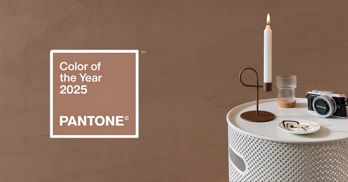
Mocha Mousse is the color of 2025, selected by the Pantone Color Institute.
Like a mousse to be eaten by the spoonful while savoring coffee and chocolate, this shade is soft, enveloping and reassuring .
Furthermore, it lends itself to various combinations in the interiors of our homes.
We take an in-depth look at Mocha Mousse which, like every Pantone color of the year, isn't just aesthetic: it's a cultural statement .
How is the Pantone color of the year chosen and why was it Mocha Mousse this year?
But how do you choose the Pantone Color of the Year? Every year, the Pantone Color Institute looks at everything that's happening in the world: the choice comes from an in-depth analysis that crosses design, fashion, art, technology and even social and climate events.
In short, the color of the year is not just a pretty nuance, it is the reflection of the historical moment we live in. 2025 is all about Mocha Mousse , a delicious and enveloping brown that seems to scream “comfort zone” but in reality is pure chic audacity.
2025 was the turn of this shade because it reflects our desire for stability, intimacy, calm and authenticity in an increasingly frenetic and uncertain world .
What's the color of 2025? We explore Mocha Mousse with an eye on decor
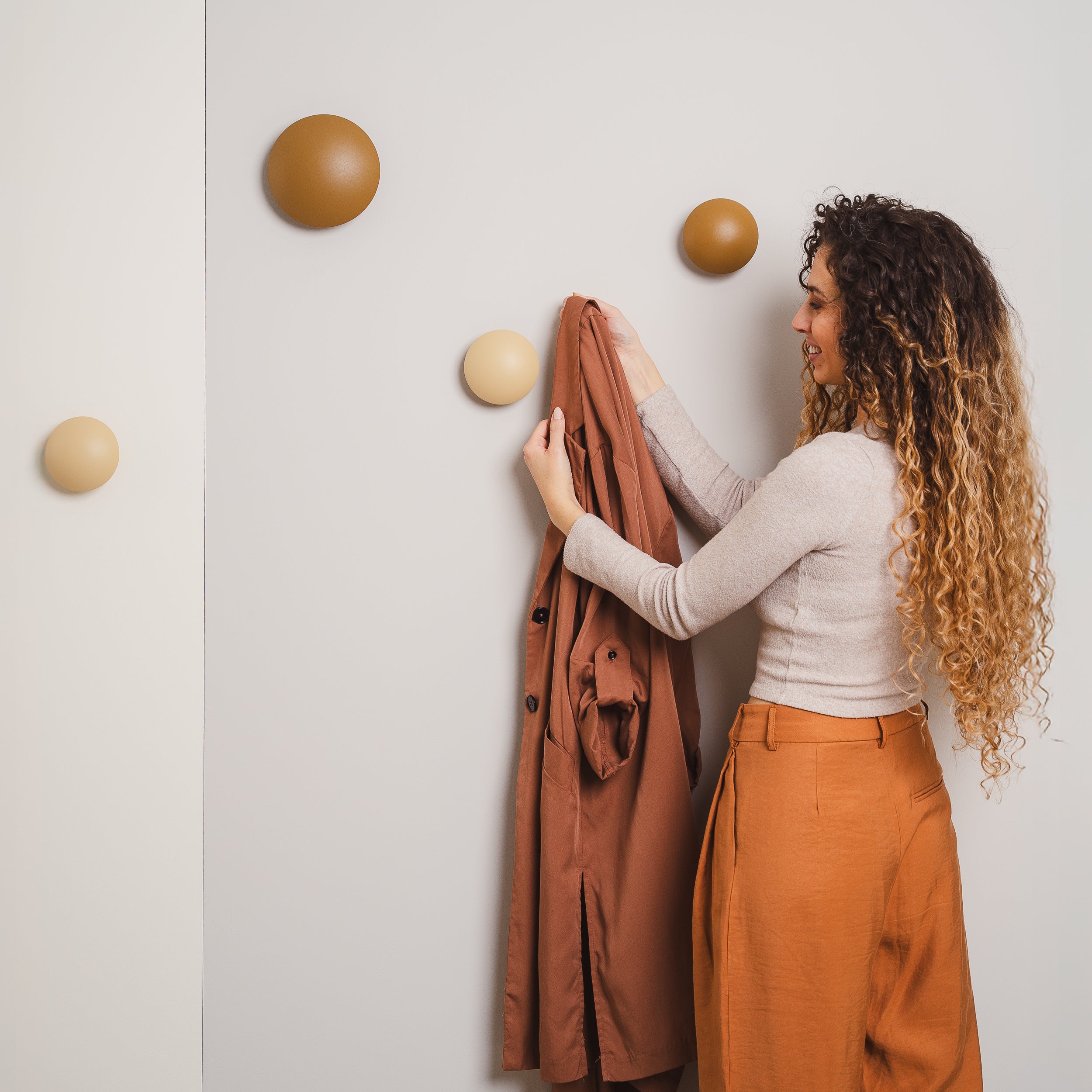
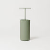
Mocha Mousse is a warm, velvety brown that recalls earth tones and the comfort of a chocolate mousse.
Its vibe ? Warm as a hug and cool enough to become the star of every home .
Mocha Mousse represents the return to dark and intense shades also in interior design , almost in contrast with the soft palette of 2024, in which the protagonist was Peach Fuzz, a light and lively peach color.
It's the color of the moment for those looking for elegance and a cozy touch that never goes out of style. And you, are you ready to bring it into your home?
Let's find out together how to combine Mocha Mousse to obtain the mood you are looking for for your spaces.
How to Match Mocha Mousse in Interior Design? 5 Combinations to Copy
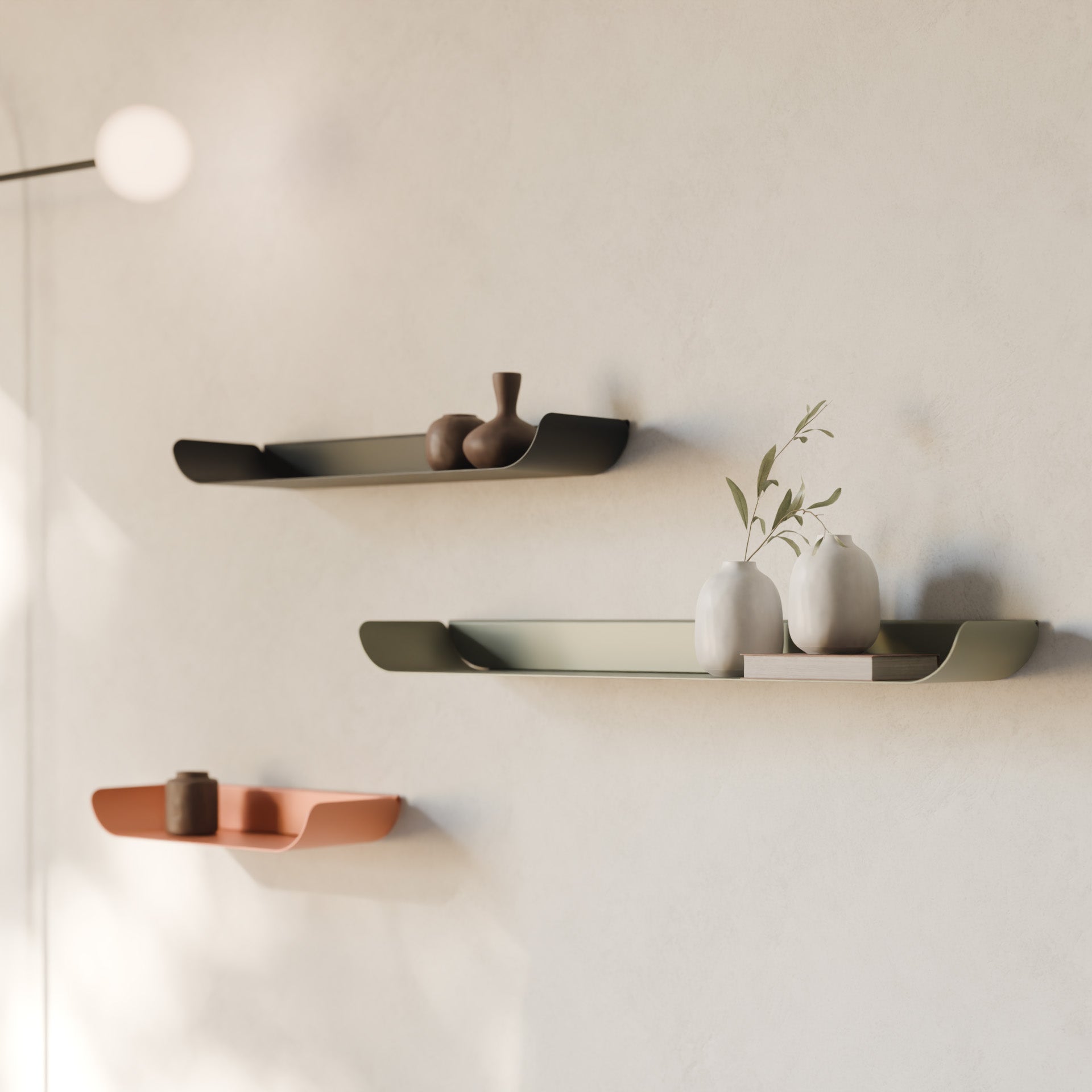
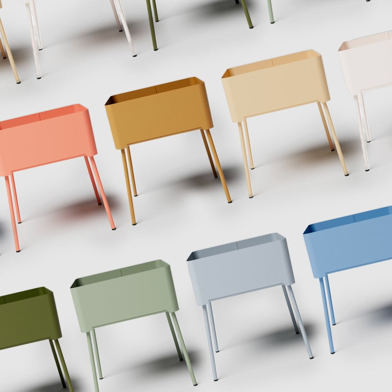
Combining Mocha Mousse in interior design means creating warm, sophisticated and harmonious environments, taking advantage of the versatility of this earthy color that behaves almost like a neutral shade, but with more character.
Thanks to its depth, Mocha Mousse lends itself to numerous color combinations that reflect different styles and atmospheres. Here are some ideas and combinations.
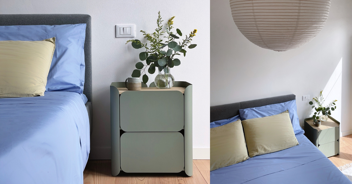
1. Mocha Mousse and Verde Fossile: the call to nature
A perfect mix for those who love natural and relaxing environments. As in a woodland landscape, the fossil green marries beautifully with the enveloping warmth of Mocha Mousse, evoking the peace and serenity of a walk in nature.
You can use Mocha Mousse for the main walls or furniture and add accessories in fossil green .
Complete with natural materials such as raw wood and linen for an even more authentic effect.

2. Mocha Mousse and Rosa Antico: intimacy and femininity
To create a welcoming and refined atmosphere, combine Mocha Mousse with antique pink.
This combination works well in bedrooms or living rooms with a romantic touch .
If you're not afraid to be daring, you can paint the walls Mocha Mousse and insert an accent piece, such as a small shelf , in dusty pink, keeping a fairly neutral palette for the rest.
To make the environment even more enveloping, add fabrics such as bouclé wool or cashmere on throws and cushions .
Alternatively, you can opt for a warm white background on which to make a key piece of furniture in Mocha Mousse stand out, such as the sofa.
Soften the contrast with some accessories (a paperweight , an organizer or a jewelry box , for example) in antique pink.

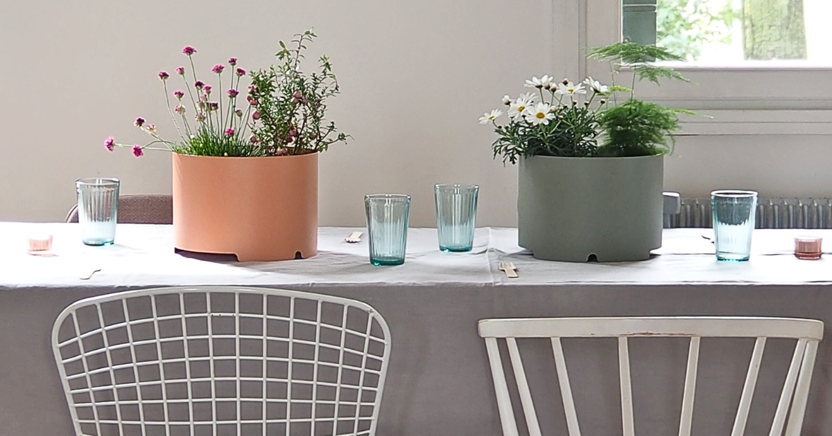
3. Mocha Mousse with Cornflower and Bianco Conchiglia: a match that dresses up holiday homes
An ideal match for both a mountain cottage and a beach house.
- If you opt for a prevalence of Mocha Mousse in your palette and add cornflower blue accessories and shell white furniture , light wood and fabrics such as wool, velvet and bouclé, then you will have the perfect mix for your mountain home.
- If you add Beige Luxor to the Mocha Mousse + Shell White + Cornflower Blue palette, accompanied by natural fibres (wicker, rattan, Vienna straw), linen and cotton, you will have created the perfect style for your seaside home.

4. Mocha Mousse, Bianco Conchiglia and Beige Luxor: neutral and refined palette
Are you a fan of neutral palettes? If you prefer a subtle yet stylish combination, use Mocha Mousse to add an interesting contrast to the combination of neutrals like Bianco Conchiglia and Beige Luxor .
You won't go too far out of your color comfort zone, but the environment will be much more complete.
This mix is perfect for creating elegant spaces, ideal for those who love essentiality.
Use Mocha Mousse to add depth and lighter tones to furniture and decor.
Add textures like velvet or wool for an extra touch of warmth.

5. Mocha Mousse and Midnight Blue: The Sophisticated Look
A winning combination for environments with great visual impact .
Midnight blue, with its intensity, enhances the warmth of Mocha Mousse, creating a modern and evocative contrast .
This combination works especially well in spaces like bedrooms or studies.
Use midnight blue for the walls or the main furnishings and Mocha Mousse for fabrics or accessories, completing with brass metal details or marble elements.
You can lighten the palette by introducing elements in Sugar Paper Grey .

In all of these combinations, the secret is to play with textures and materials to enrich the color scheme , creating spaces that are visually interesting and functional for your lifestyle.
Let's relive the Pantone colors of the last 5 years
In recent years, Pantone has chosen colors that reflect global trends and collective emotions. Here are the most recent Pantone Colors of the Year:
-
2020: Classic Blue (19-4052)
A timeless blue, chosen to evoke calm, trust and connection in a complex historical period.
-
2021: Ultimate Gray (17-5104) and Illuminating (13-0647)
For the first time, two colors shared the title, symbolizing resilience (gray) and hope (yellow).
-
2022: Very Peri (17-3938)
An innovative periwinkle blue with purple-red undertones, which represented the marriage between physical and digital.
-
2023: Long Live Magenta (18-1750)
A bold carmine red, a hymn to vitality and passion.
-
2024: Peach Fuzz (13-1023)
A warm peach color, chosen for its sense of welcome and optimism.
The color of 2025, Mocha Mousse, fits into this tradition, representing the search for comfort and authenticity.
These choices reflect not only aesthetic trends, but also responses to global social and cultural changes.