

It's raining outside, it's cold and the sky is that sad grey that makes you feel melancholy?
While it is true that we can't do anything about the weather, it is also true that, on the contrary, at home we can combat that greyness that seems to dull everything.
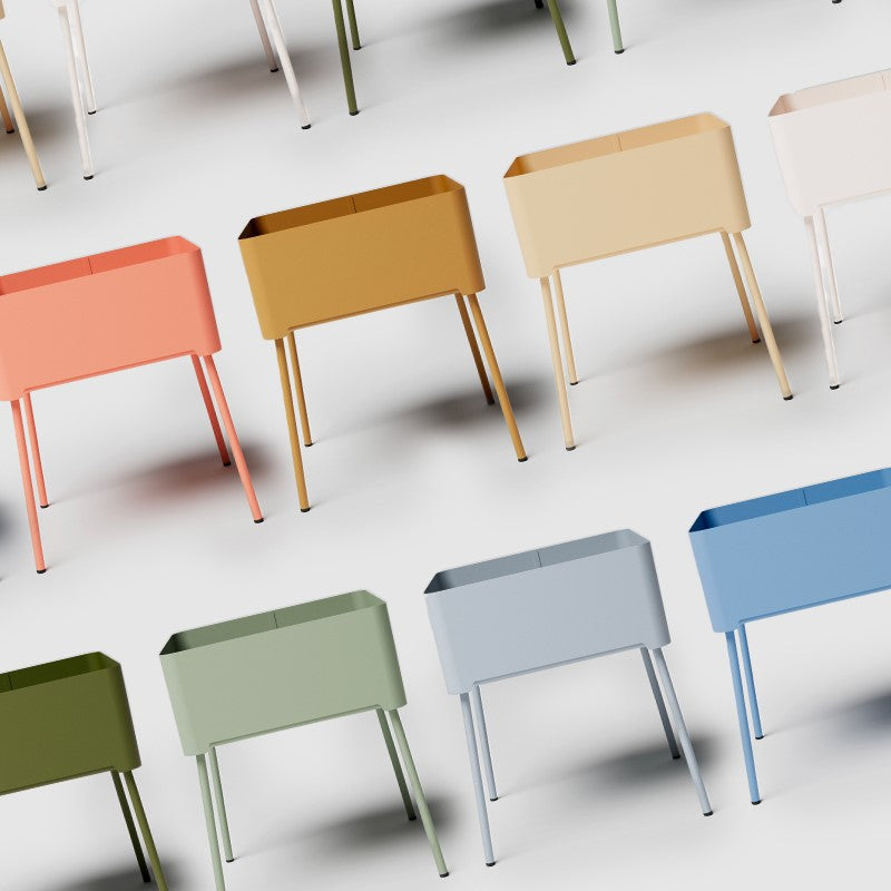
How? With color, just select the right warm shades for plaids, cushions, accessories and new furnishing accessories such as tables, shelves, coat racks and trays.
And if you think that warm colors are only for rustic homes, prepare to think again: in this article we reveal some color proposals perfect for meeting your existing palette and your style, from the essential Scandinavian to the most sophisticated retro.
How Warm Colors Affect Our Perception of Heat
Did you know that colors actually influence our perception of temperature?
One of the best-known experiments was conducted in the 1970s by psychologist Humphrey Osmond and later taken up by various environmental psychology studies.
In short, a group of people were asked to enter two different rooms, with the same actual temperature, but with different colors on the walls:
- a room with red and orange walls;
- a room with blue and green walls.
The result? People in the red-orange room reported feeling warmer than those in the blue-green room, but the temperature was identical.
So, our perception of heat depends not only on physical reality, but also on the way our brain interprets the colors around us .
This is why, even without increasing the actual temperature of the room, surrounding yourself with warm tones can make you feel more wrapped up and pampered.
Tell us what palette you have and we'll give you the perfect warm color for your space
Don't be afraid to add a warm color to your palette.
We'll make things easier for you with some practical examples.
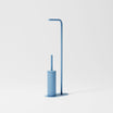
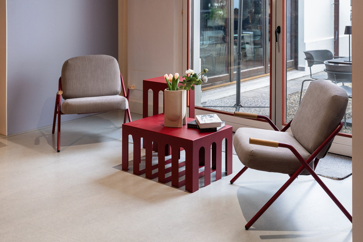
- If you have a palette that is all about blues, grays, or cool greens like emerald, petrol, or turquoise, you can surprise with an unexpected touch of red. For example, you can match your sofa with a Frida or clay red coffee table.
You can use these same colors to add vitality and contrast to an all-gray bathroom, by focusing on designer bathroom accessories .
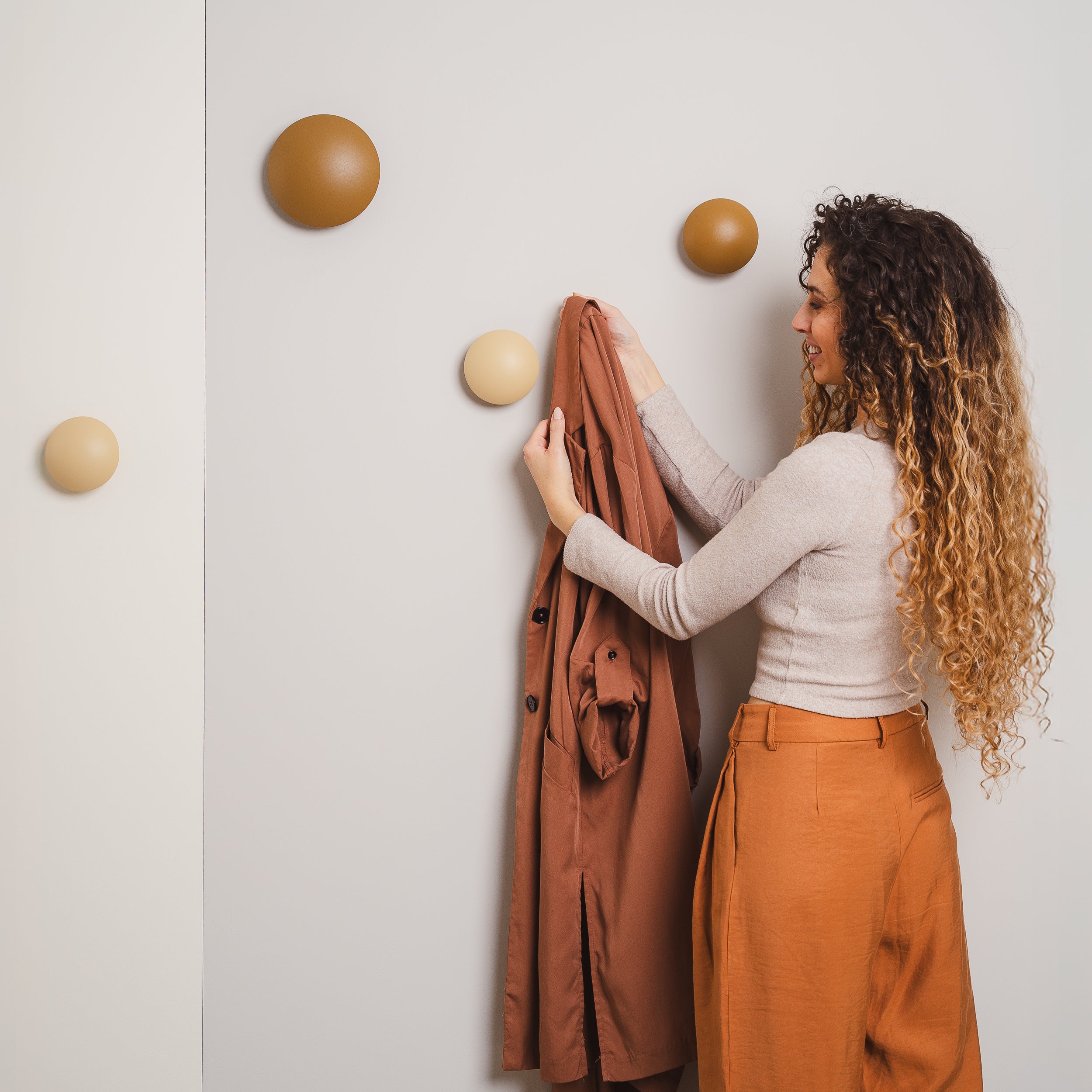
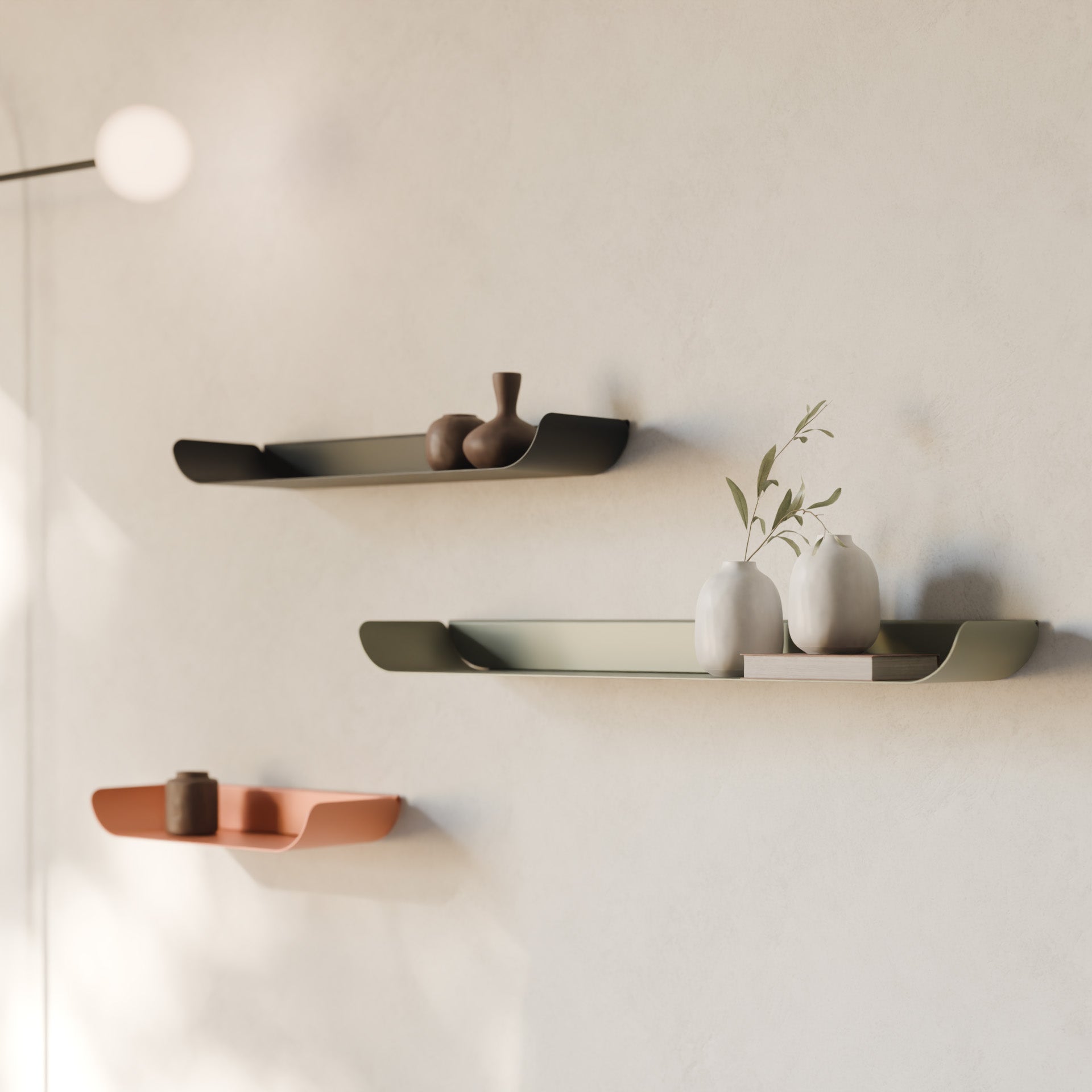
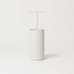
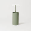
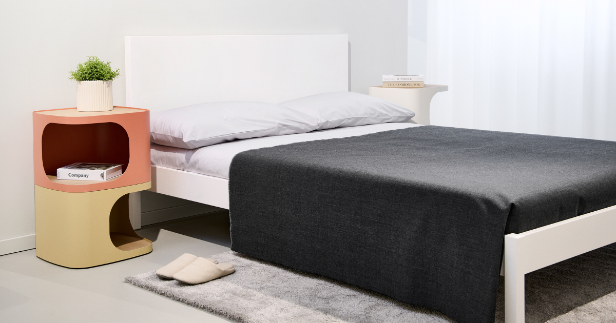
- If, on the other hand, you have a completely neutral palette or an environment composed of warm wood essences and greens such as sage, olive or military green, opt for cinnamon.
It is an earthy brown that will add warmth and character to your interiors.
You can use it, for example, for the TV cabinet or in smaller doses, for trays or decorative shelves.
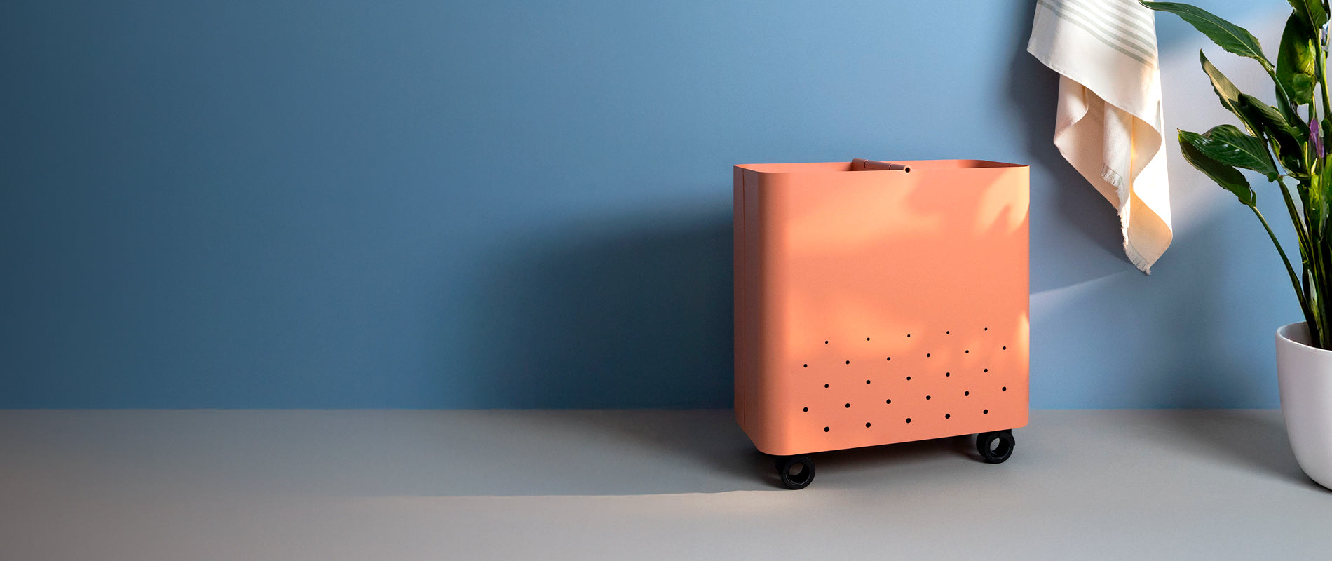
- Are pastel shades and light wood your thing? Then terracotta and vanilla are perfect for your palette. They pair well with all the “candy” colors, even the colder ones like mint green and powder blue.
- Finally, if your interiors are dominated by white and feature wooden, brass or gold details, you can make the environment warmer and more refined with an elegant touch of antique pink.
Cinnamon color: a warm and enveloping hug
The cinnamon color (RAL 8000) is a spicy, intense and earthy brown, which recalls the charm of the lands of the East. It is a color that envelops and reassures, perfect for making a space more welcoming, without distorting it.
It works great with natural wood, beige and olive green, but can also surprise next to brass details and midnight blue velvet.
Cinnamon is also an excellent binder for an autumnal palette that includes several warm colours, such as blush pink, beige and terracotta.

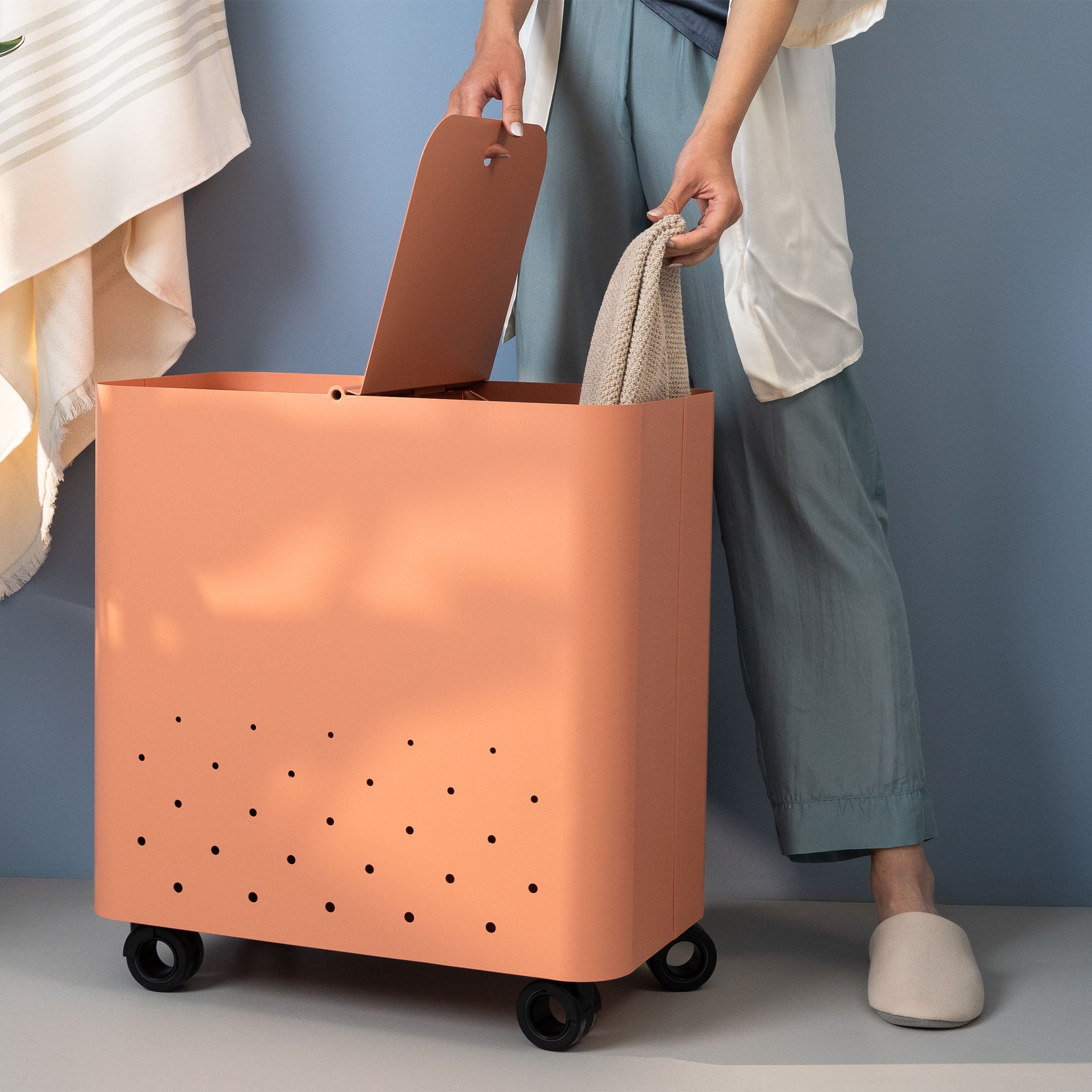
Terracotta color: the warmth of the earth
Terracotta (RAL 3012) is a perfect mix of pink and orange. It is the color of tiles under the sun, of Mediterranean majolica, of the most poetic sunsets.
It has a revitalizing power.
Pair it with white to make it the absolute protagonist or with shades of green to bring a touch of freshness.

Red Frida and Clay: Passion vs. Balance
Rosso Frida (RAL 3004) is a deep, dark red with a hint of burgundy that makes it elegant and sophisticated. It is the color of passion, art, and warmth that does not go unnoticed. Use it for strong accents on furnishings or details.
Clay (RAL 2013) is softer, with an orange base that makes it more natural and delicate. It transmits vitality and is strongly linked to the earth.
Both shades are perfect in contemporary or retro contexts, but the clay color also fits perfectly in rustic contexts.

Vanilla color: the morning light
The color vanilla (RAL 1001) is a warm, creamy shade, halfway between beige and pale yellow.
It is the color of the first ray of sunshine that enters through the window.
This is a restful yellow, perfect for those looking for a bright and enveloping environment. It goes very well with light wood, warm white and caramel shades.
You can insert it in a rustic, Scandinavian or romantic context, but it gives its best in homes inspired by the 50s, 60s or 70s.

Antique pink: timeless elegance
Antique pink (NCS S 3020R) is a sophisticated and dusty shade. It is not pastel pink, nor baby pink: it is a soft and delicate color, capable of giving a touch of class without being cloying.
Perfect with grey for a refined effect, with brass for a vintage look, with brick colour for a warm and welcoming mix.
It looks great in contexts where classic meets modern or where vintage takes center stage.

The living room is a great place to start experimenting with warm colors.
If you want to try warm colors but are afraid to dare too much, the living room is the right place to start . Here you spend most of your time, you receive friends, you relax on the sofa.
You can start by adding small accessories like a coffee table , a pillow case or a tray to put on the coffee table. If you like, you can go further, perhaps with a colorful piece of furniture or a set of chairs in warm colors .
Are you looking for ideas and inspiration? You can find furniture, accessories and decorations in the colors we have told you about in this article in our shop.