


You’re at the crucial moment: the walls have just been painted and now the big dilemma remains: which furniture to choose?
This is where the matching of wall and furniture colors makes the difference.
Every color choice must interact with the space, the light, the floor, and the personality of the home.
A mistake can “dull” even the most beautiful furniture. On the other hand, a well-constructed combination can highlight shapes and bring balance.
This article is a mini lesson on color matching between walls and furniture: we explore the basic principles and how to apply them, to help you make your decision with confidence.
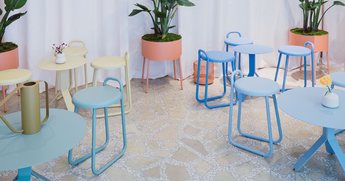
How to tell if colors go well together? Basic rules
At the base of every color project are the fixed elements of the house: floor color, window frame color, covering colors, and all those elements that are part of the house’s envelope. Yes, the color of materials also matters when choosing colors for walls, furniture, accessories, and complements.
Each shade, in fact, is perceived differently depending on what is next to it.
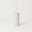
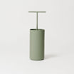
Let’s do an experiment with the Altea round planter.
If we place the same terracotta-colored planter first in front of an India blue wall and then in front of a brick wall, the terracotta will seem warmer when placed in front of the cool wall.
In the image below, it’s interesting to note how even the floor seems to change color from one photo to another, even though, overlaying the two images, the floor area is exactly the same: the colors around a piece of furniture completely influence our perception.

The easiest way to choose colors well is to understand how they “work” together.
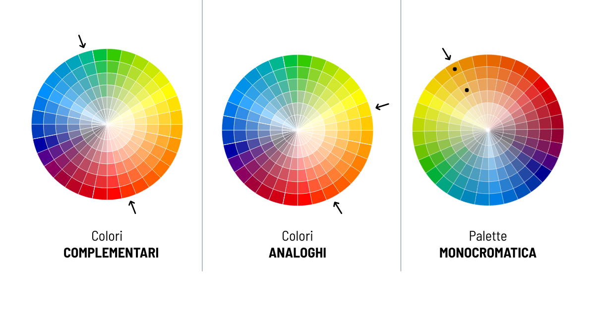
Here are some ways to balance the color contrast between walls and furniture using the color wheel.

Complementary colors → are those opposite on the color wheel, like blue and orange. Together they create contrast and make both the furniture and the wall stand out.

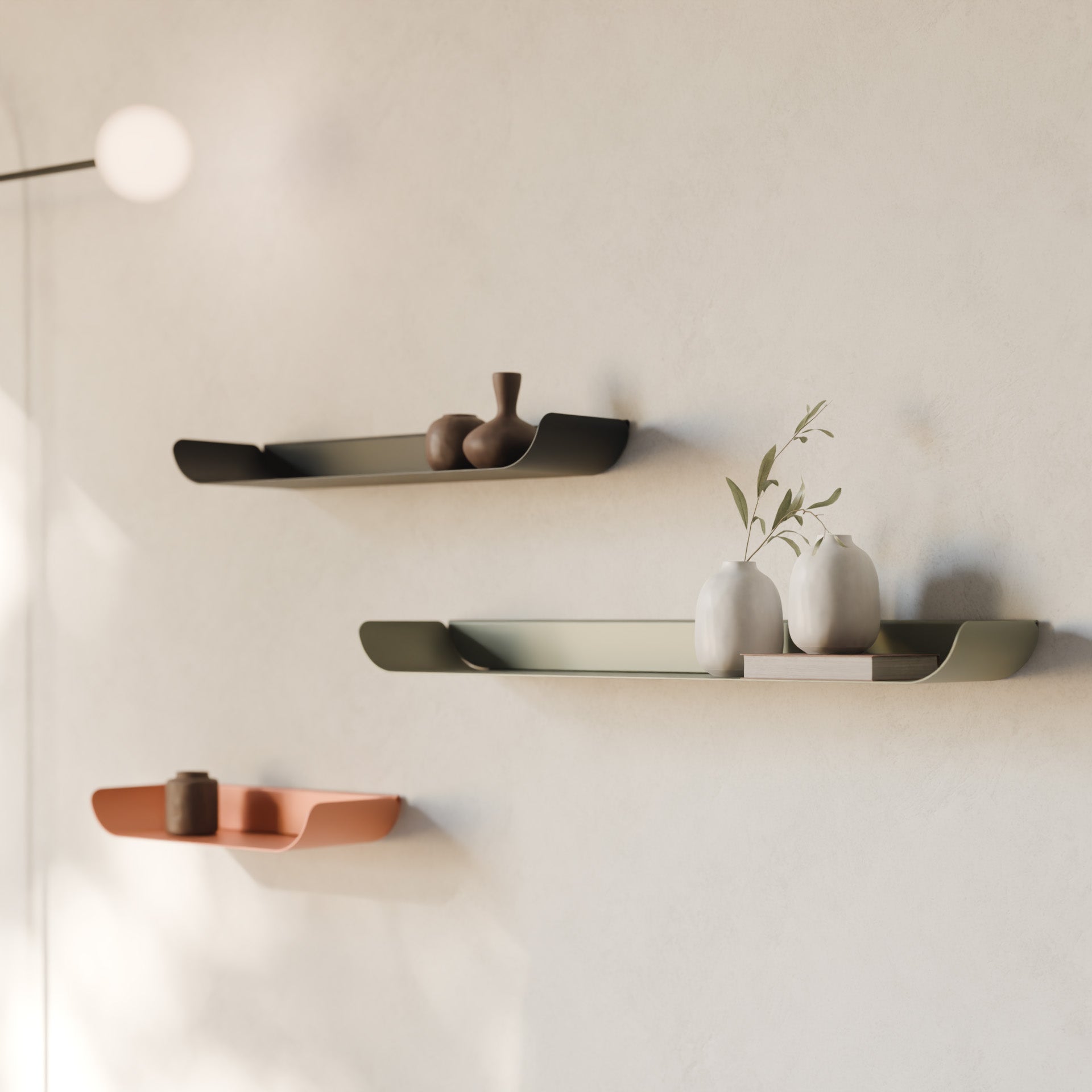
Analogous colors → are those next to each other on the color wheel, like pistachio green, lemon yellow, and ochre. Together they create a harmonious effect, perfect if you don’t like strong contrasts.

Tone on tone → you can repeat the same hue in two shades: one lighter and the other darker.
Applying these rules in practice becomes much easier when you can see and touch the colors in person: materials, finishes, and natural light always influence the final result.
Order the Hiro color sample kit and easily choose the shades for your Made in Italy furniture!
For example, you can contrast a blue wall with a TV stand in sugar paper color. This is the easiest choice, but if the two colors are too similar, the furniture risks blending into the wall.

Another important thing is understanding how bright or muted a color is (saturation): a vibrant tone next to a neutral one (like clay color next to beige) can be pleasant, while two very strong colors together risk clashing.
How to match wall color to furniture
When the wall color is already defined, the furniture must complement, not compete.
Walls and furniture should differ enough to enhance each other, but always communicate harmoniously.
Matching furniture to neutral walls: which colors work best?
Taupe, beige, grays, and whites are not always truly neutral. They often contain hints of pink, orange, green, or blue.
It is essential to consider the undertone of so-called neutral shades when choosing furniture to pair.
Neutral and light walls are the perfect backdrop for bold or dark accents.
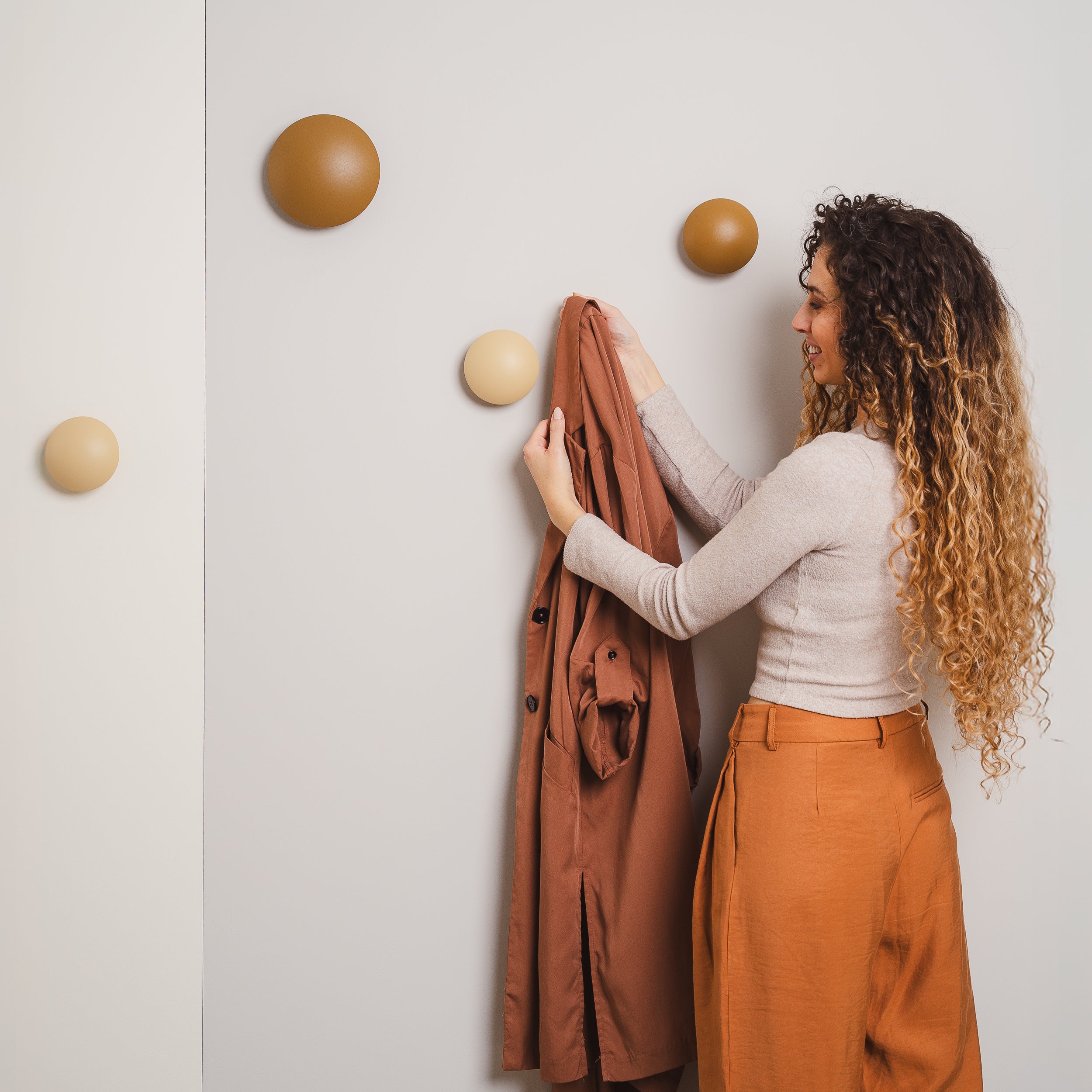
For example, you can place a cinnamon-colored coat rack against an ivory wall or match a steel green shelf with a light gray wall that has a hint of green.

Warm walls and cool-colored furniture (and vice versa): a subtle balance
If you like both warm and cool colors, pay close attention to the combinations between the two color families. The risk is creating a dissonant mix where the furnishings all seem disconnected from each other.
For a palette that combines both warm and cool colors, you can choose, for example, two or three warm colors of the same tone (e.g., three reds, three oranges, or three yellows…), in lighter or darker shades, and add just one accent element in a contrasting cool color.
If the cool color is the complementary of the warm tone that dominates the room, it will really stand out and become the focal point, making the combination pleasant and striking.

You can do the same using a cool shade in different tones for most of the room and add a warm color on a contrasting element.
For example, in the bedroom, you can paint the walls dark green, pair it with a sage green upholstered bed, and complete the look with terracotta-colored nightstands.
Managing color matching with brown or wooden furniture
Wooden furniture is a warm and timeless presence, but the secret to really making it stand out lies in the color of the walls around it.
§Wood is a living material: it changes tone depending on the light and the colors nearby. That’s why choosing the right wall can completely transform the atmosphere of a room.
To get a good result, the first thing to observe is the undertone of the wood. Each type of wood can lean towards pink, orange, red, yellow, green, or gray. The same applies to lacquered or painted brown furniture, which often hides a very specific undertone.
Keep this in mind when choosing the wall color.
If you want a harmonious and soft effect, choose a shade that matches the undertone of the wood.
If instead you want to create a stronger contrast, you can opt for colors complementary to the wood’s undertone. The color wheel helps a lot with this, but testing with a color sample is always necessary.

A light-dark contrast to attract attention
In general, dark wood furniture (walnut, wenge, mahogany) is enhanced by light and bright walls that create contrast and visually lighten the room.
Light wood furniture (oak, ash, birch) instead stands out more next to medium-dark walls or, generally, colored walls. Here the contrast is both chromatic and sensory: the wall becomes the perfect background that highlights the material.

Wall and furniture color matching: how to choose without mistakes
To recap, to find the best wall and furniture color combination for your home, always keep these points in mind.
-
Start with fixed elements: flooring, window frames, and natural light guide all subsequent choices.
-
Observe the undertone of materials and so-called neutral shades: it’s the key to creating coherent harmonies.
-
Use the color wheel to understand if you prefer contrasts (complementary) or soft combinations (analogous or monochromatic palettes).
-
Play with saturation: pair muted and vibrant tones to add depth.
- With wood, work on light/dark contrast or complementary colors to its undertone if you want to impress. Match the wood’s undertone to the wall color for a softer effect.
- And above all, always test with real samples to see how your furniture changes with the light and to test combinations with the walls and other surfaces in the room.
Order a sample of your colored made in Italy Hiro furniture and bring sustainable design, quality materials, and perfect shades for every palette into your home.

